UI widgets for A-Frame.
Works with HTC VIVE and Oculus touch in a WebVR enabled browser and desktop with aframe-mouse-cursor-component.
Basic usage
<head>
  <title>My A-Frame Scene</title>
  <script src="https://aframe.io/releases/0.7.0/aframe.min.js"></script>

  <!-- Include component script into your project along with A-Frame. -->
  <script src="https://rawgit.com/caseyyee/aframe-ui-widgets/master/dist/aframe-ui-widgets.min.js"></script>
</head>

<body>
  <a-scene>
    <!-- Adds hand controls -->
    <a-entity hand-controls="left"></a-entity>
    <a-entity hand-controls="right"></a-entity>

    <!-- Can also be controlled used with cursor -->
    <a-camera>
      <a-cursor></a-cursor>
    </a-camera>

    <!-- Adds UI button widget -->
    <a-entity id="mybutton" ui-button></a-entity>
  </a-scene>
  <script>
  var mybutton = document.querySelector('#mybutton');
  mybutton.addEventListener('pressed', function () {
    // do stuff here.
  });
  </script>
</body>
Skinnable with custom styles
Using mixins, you can define a UI component styles.
<a-assets>
  <a-mixin id="beveled-square" geometry="primitive: cone; radiusTop: 0.15; radiusBottom: 0.19; height: 0.02; segmentsRadial: 4; segmentsHeight: 1" rotation="0 45 0"></a-mixin>
  <a-mixin id="square" geometry="primitive: box; width: 0.18; height: 0.025; depth: 0.18;" position="0 0.02 0"></a-mixin>
  <a-mixin id="blue" material="color: #1E2768;"></a-mixin>
  <a-mixin id="darkgreen" material="color: #22FF90;"></a-mixin>
  <a-mixin id="yellow" material="color: #FFF88E;"></a-mixin>
  <a-mixin id="offset" position="0 0.01 0"></a-mixin>
</a-assets>

<a-entity id="button" ui-button="base: beveled-square, blue; top: square, darkgreen; pressed: yellow, offset"></a-entity>
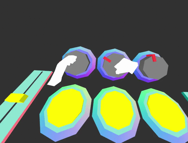
UI Components
Button
<a-entity ui-button></a-entity>
Properties
| Property | Description | Default Value |
|---|
| base | mixins to use for button base. | |
| top | mixins to use for button top. | |
| pressed | mixins to use for when button is pressed (added to top). | |
| color | default button color | #960960 |
| pressedColor | default button-pressed color | #FC2907 |
| baseColor | default button-base color | #618EFF |
| topY | default button top height | 0.02 |
| pressedY | default button pressed height | 0.012 |
Events
| Event | Description |
|---|
| buttondown | Emitted when button is pushed down. |
| buttonup | Emitted when button is released. |
| pressed | Emitted when button has been has been pushed down and released. |
Toggle switch
<a-entity ui-toggle></a-entity>
Properties
| Property | Description | Default Value |
|---|
| value | sets toggle position. | 0 |
Events
| Event | Description |
|---|
| change | Emitted when switch has been toggled. |
Slider
<a-entity ui-slider></a-entity>
Properties
| Property | Description |
|---|
| min | sets minimum value |
| max | sets maximum value |
| value | sets value |
Change
| Event | Description |
|---|
| change | Emitted when slider has been moved. |
Rotary Knob
<a-entity ui-rotary></a-entity>
Events
| Event | Description |
|---|
| change | Emitted when rotary has been turned. |
npm
Install via npm:
npm install aframe-ui-widgets
Then require and use.
require('aframe');
require('aframe-ui-widgets');