README
VR-Viz 

VR-Viz provide a high-level react components to generate 3D visualization in webVR. It combines A-Frame with React (for DOM manipulation) and D3 (for data visualizations) to generate visualization in VR. It provides a JSON syntax for generating visualizations (the concept is inspired from Vega-Lite)
Interactive examples can be seen and explored here.
Boilerplate for using VR-Viz can be found here.
Recent Updates
- Updated the A-Frame and Three.js version used (now works on all the major modern browsers)
- Changes all geometries to BufferGeometries which result in inproved performance
- Added default values for all the non compulsary parameters in different graph settings
- Add projection feature in bar graph to show the cuummulative data
- Added rotationOnDrag feature which let the user to rotate the visualization on drag on computers
- Added billboarding for all the text by default
If using NPM
Package link: https://www.npmjs.com/package/vr-viz
Installation
npm install --save vr-viz
How To Use
First import this component where you want to use it
import VRViz from "vr-viz"
Then just renders it
Local Development Using this Repo
This project can be deployed using yarn or node. Install yarn as described here https://yarnpkg.com/en/docs/install if you haven't already or node as described here https://nodejs.org/en/ if you haven't already.
To install this boilerplate, simply clone the repo and run yarn or npm install;
git clone https://github.com/mustafasaifee42/VR-Viz.git
cd vr-viz
yarn
In the project directory, you can run:
yarn start
or using node
git clone https://github.com/mustafasaifee42/VR-Viz.git
cd vr-viz
npm install
In the project directory, you can run:
npm run start
Runs the app in the development mode.
VRViz Component
The react component used to generate visualizations is VRViz with 2 props:
- scene
- graph
scene defines the property of the A-Frame scene that will be generated in which the visualization will be placed. This is not a mandatory prop in the component. If the developers feels the need to design the scene before and then place the visualization in the designed scene he/she can do that. This provide flexibility to design a customized scene with textures and objects in it and also let the developers add other A-Frame component (to add interactivity or animation) to scene.
graph is the prop where the visualization is defined. Different visualization requires the developer to define different parameter. This is a mandatory prop in the component. The prop must be defined as an array which gives flexibility to add multiple visualizations in the same scene to either design a dashboard in VR (just by changing the position of their origin) or overlap multiple visualization on each other.
Example of Visualization Component
<VRViz
  scene={
    {
      'sky': {
        'style': {
          'color': '#ccc',
          'texture': false,
        }
      },
      'lights': [
        {
          'type': 'directional',
          'color': '#fff',
          'position': '0 1 1',
          'intensity': 1,
          "decay": 1,
        },
        {
          'type': 'ambient',
          'color': '#fff',
          'intensity': 1,
          "decay": 1,
        }
      ],
      'camera': {
        'position': '0 0 10',
        'rotation': '0 0 0',
      },
      'floor': {
        'style': {
          'color': '#ccc',
          'texture': false,
          'width': 100,
          'depth': 100,
        }
      },
      'parentDiv':{
        'class':'graph',
        'height':1000,
        'width':1000
      },
      'reloadPageOnExitVR':true
    }
  }
  graph={
    [
      {
        'type': 'TreeMap',
        'data': {
          'dataFile': "data/TreeMap.json",
          'fileType': 'json',
        },
        'style': {
          'origin': {'x': 0, 'y': 0, 'z': 0},
          'dimensions': {
            'width': 50,
            'depth': 50,
            'height': 5,
          }
        },
        'mark': {
          'type': box,
          'style': {
            'paddingInner': 0.5,
            'paddingOuter': 0.1,
            'extrusion': {
              'field': 'size',
              'startFromZero': true,
            },
            'fill': {
              'scaleType': 'ordinal',
              'opacity': 1,
            },
          },
        },
      }
    ]
  }
/>
Scene Object
Scene object help the developer to define the characteristics of the scene where the visualization will be placed. As mentioned above the scene object is not mandatory. Different keys in this object help us to define the scene.
Example
{
  'sky': {
    'style': {
      'color': '#ccc',
      'texture': false,
    }
  },
  'lights': [
    {
      'type': 'directional',
      'color': '#fff',
      'position': '0 1 1',
      'intensity': 1,
      "decay": 1,
    },
    {
      'type': 'ambient',
      'color': '#fff',
      'intensity': 1,
      "decay": 1,
    }
  ],
  'camera': {
    'position': '0 0 10',
    'rotation': '0 0 0',
  },
  'floor': {
    'style': {
      'color': '#ccc',
      'texture': false,
      'width': 100,
      'depth': 100,
    }
  },
  'parentDiv':{
    'class':'graph',
    'height':1000,
    'width':1000
  },
  'reloadPageOnExitVR':true
}
6 main features / properties of the scene objects are:
- sky
- lights
- camera
- floor
- 3D-objects (optional)
- parentDiv (optional)
- reloadPageOnExitVR (optional)
sky
Sky has property called style in which the visual properties of sky is defined.
Style Properties for Sky
| Property | Type | Description |
|---|---|---|
| color | string | Color of the skybox. Not Required if texture is true. |
| texture | bool | If there is texture present in the skybox or not. Default value is false. |
| img | string | Path to the texture / image that is shown on the skybox. Not required if texture is false. |
lights
Light property is defined as array which can have multiple lights. Proposed light system is a combination of an ambient light source and directional light source. Each element of array i.e. light is defined using the properties mentioned below.
Properties for Light
| Property | Type | Description |
|---|---|---|
| type | string | Type of light. Required. Available values: ambient, directional, point. |
| color | string | Color of the light. Required |
| intensity | float | Intesity of the light. Required |
| decay | float | Decay value of the light. Required |
| position | string | Position of light source. Not required if type is ambient. Format is "0 0 0". Note that for type directional only the vector matters i.e. position="-100 100 0" and position="-1 1 0" are the same. |
camera
Properties for Camera
| Property | Type | Description |
|---|---|---|
| position | string | Position of the camera. Required. Format is "0 0 0". |
| rotation | string | Rotation of the camera. Required. Format is "90 0 0". Note that the values are in degree and the numbers represent ratation along x-axis, y-axis and z-axis respectively. |
floor
Floor has property called style in which the visual properties of floor is defined.
Style Properties for Floor
| Property | Type | Description |
|---|---|---|
| color | string | Color of the floor. Not Required if texture is true. |
| width | float | Width of the floor. Required |
| depth | float | Depth of the floor. Required |
| texture | bool | If there is texture present in the floor or not. Not Required. Default value is false. |
| img | string | Path to the texture / image that is shown on the floor. Not Required if texture is false. |
| repeat | bool | Not Required if texture is false. |
3D-objects
3D-objects property is defined as array which can have multiple 3D objects. Each element of array i.e. 3D object is defined using the properties mentioned below.
Properties for 3D-objects
| Property | Type | Description |
|---|---|---|
| objectFile | string | Path of the 3D object. Required |
| id | string | ID of the 3D object which is later used to identify this object. There should not be any space or special character except and must not start with a number. Required |
parentDiv (optional)
parentDiv defines the class and size of the div in which a-scene is embedded.
Properties for parentDiv
| Property | Type | Description |
|---|---|---|
| class | string | Defines the class name of the div in which a-scene is embedded. Default value is aframeBox. |
| height | int | Defines the height of the div in which a-scene is embedded. Default value is height of the window or browser. |
| width | int | Defines the height of the div in which a-scene is embedded. Default value is width of the window or browser. |
reloadPageOnExitVR (optional)
Defines if the user wants to reload the page when exiting VR mode. Is useful when there are multiple a-scene in the same page. Not Required. Default value: false. Format:''reloadPageOnExitVR':true
Graph Object
Graph object help the developer to define the visualization. Although different visualizations requires the developer to define different parameters, there are some features which are same for most or all visualization type. This is a mandatory prop in the component. The prop must be defined as an array which gives flexibility to add multiple visualizations in the same scene to either design a dashboard in VR (just by changing the position of their origin) or overlap multiple visualization on each other.
Main features / properties of the graph objects are:
- type
- optimizeView
Only applicable for ScatterPlot and PointCloud - data
- style
Not Required - mark
- axis
Not Required - title
Not Required - rotationOnDrag
Not Requred - animateRotation
Not Required
type
type is used to define what kind of visualization is needed. The availabe values for type are :
Charts
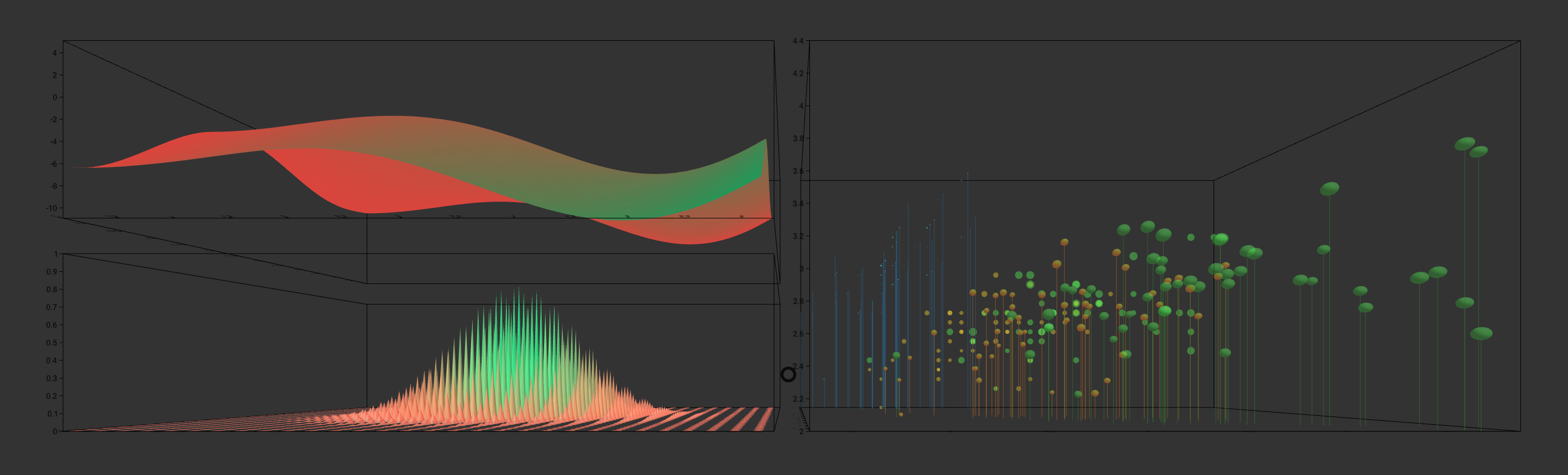
BarGraphfor 3D Bar GraphStackedBarGraphfor 3D Stacked Bar GraphLollipopChartfor 3D Lollipop ChartRectangleChartfor 3D Rectangle ChartScatterPlotfor 3D Scatter Plot / 3D Bubble ChatConnectedScatterPlotfor 3D Connected Scatter PlotMeshPlotfor 3D Mesh PlotWaterFallPlotfor Waterfall PlotTimeSeriesfor 3D Time SeriesSpiralPlotfor 3D Spiral Plot
Maps
PrismMapfor 3D Prism MapMapBarGraphfor 3D Map Bar GraphMapStackedBarGraphfor 3D Map Stacked Bar GraphMapTimeBarsfor Time Series on MapIsolineMapfor 3D Map with Iso LineFlowMapfor 3D Flow Map
Diagrams
CrossSectionViewfor 3D Cross Sectional View or 3D ModelsContourMapfor 3D Contour MapPointCloudfor 3D Point CloudForceDirectedGraphfor 3D Force Directed GraphTreeMapfor 3D TreeMap
Plots
ContourPlotfor 3D Contour PlotParametricCurvePlotfor 3D Parametric Curve PlotSurfacePlotfor 3D Surface PlotParametricSurfacePlotfor 3D Parametric Surface Plot
Supported Visualizations
Charts
- 3D Bar Graph
- 3D Stacked Bar Graph
- 3D Lollipop Chart
- 3D Rectangle Chart
- 3D Scatter Plot / 3D Bubble Chat
- 3D Connected Scatter Plot
- 3D Mesh Plot
- Waterfall Plot
- 3D Time Series
- 3D Spiral Plot
Maps
Diagrams
Plots
optimizeView bool
Only applicable for ScatterPlot and PointCloud. This boolean property which can be used to plot scatter plot and point clouds with millions of points. If this is true, properties like opacity and any mouse event on the individual data points like clicks and hover will be ignored. This should be used if the data set is greater than 10,000 points.
data
Properties for Data
| Property | Type | Description |
|---|---|---|
| dataFile | string | Path to location where the data file is located. Required for most visualization type except for curve plot, surface plot, parametric curve plot and parametric surface plot. |
| fileType | string | Type of value. Available values: csv, json, ply, text. If the value of fileType is not mentioned the dataFile is taken as a json variable. csv fletype must have header; text is used for csv without header. |
| desc | array | Description of the header. Required only if the fileType is csv. Example: [['Year', 'date','YYYY'], ['geoJson', 'jsonObject'], ['Tornadoes', 'text'], ['Deaths', 'number']]. If the data type for a particular header is date or time then the format is also required. Available formats can be seen here. Moment.js is used to parse dates and time. |
style Not Required
Properties for Style
| Property | Type | Description |
|---|---|---|
| origin | object | Defines the position where the origin of the graph is placed. Keys in the object are x, y and z.Not Required. Default value: {x: 0, y: 0, z: 0}. Not all keys are required also. |
| rotation | string | Defines the rotation of the chart. Not Required. Default value: '0 0 0' Format example: '-90 0 0' |
| dimension | object | Defines the dimension of the graph. Keys in the object are width, depth and height. The value for all these keys are float type. Not Required. Default value: {width: 10, height: 10, depth: 10}. |
| pivot | object | Defines the pivot point around which the graph can be rotated using animateRotation or on mouse drag. Keys in the object are x, y and z.Not Required. Default value: {x: 0, y: 0, z: 0}. Not all keys are required also. |
mark
mark is used to define the style and encoding for graphics in different visualizations. Different visualizations have different mark properties and key. These are discussed further in the documentation of individual visualizations.
axis Not Required
axis is used to define and draw the x, y and z axis. This object is not compulsory. If this object is not present none of the axes are drawn.
Example
'axis': {
  'axis-box': {
    'color': 'black',
  },
  'x-axis': {
    'orient': 'bottom-back',
    'title': {
      'text': '',
      'fontSize': 10,
      'color': 'black',
      'opacity': 1,
    },
    'ticks': {
      'noOfTicks': 10,
      'size': 0.1,
      'color': 'black',
      'opacity': 1,
      'fontSize': 10,
      'rotation': '-90 0 0',
      'align':'center'
    },
    'grid': {
      'color': 'black',
      'opacity': 1,
    }
  },
  'y-axis': {
    'orient': 'bottom-back',
    'title': {
      'text': '',
      'fontSize': 10,
      'color': 'black',
      'opacity': 1,
    },
    'ticks': {
      'noOfTicks': 10,
      'size': 0.1,
      'color': 'black',
      'opacity': 1,
      'fontSize': 10,
      'rotation': '-90 0 0',
      'align':'center'
    },
    'grid': {
      'color': 'black',
      'opacity': 1,
    }
  },
  'z-axis': {
    'orient': 'bottom-back',
    'title': {
      'text': '',
      'fontSize': 10,
      'color': 'black',
      'opacity': 1,
    },
    'ticks': {
      'noOfTicks': 10,
      'size': 0.1,
      'color': 'black',
      'opacity': 1,
      'fontSize': 10,
      'rotation': '-90 0 0',
      'align':'center'
    },
    'grid': {
      'color': 'black',
      'opacity': 1,
    }
  }
}
axis has the 2 main type of objects
- axis-box
- x-axis, y-axis, z-axis
Note: For spiral chart the axis prop is not defined like below. To see the axis prop in spiral chart read the documentation of spiral chart here.
axis-box
Defines if the axis-box is drawn or not and the color and opacity of the axis box. Not Required. If the object is not present then the axis-box is not drawn. The dimensions of the axis box is taken from the dimension object in style
Properties for axis-box
| Property | Type | Description |
|---|---|---|
| color | string | Defines the color of the axis box. Required |
| opacity | float | Defines the opacity of the axis box. Reqruied. Value must be between 0 and 1 |
x-axis, y-axis, z-axis Defines if the different axes are drawn or not. Not Required. If an object is not present then that axis is not drawn.
Properties for x-axis, y-axis, z-axis
| Property | Type | Description |
|---|---|---|
| orient | string | Defines where the ticks are displayed. Not Required. Default value for x-axis: front-top. Default value for x-axis: front-left. Default value for x-axis: bottom-left.. Available values for x-axis: front-top, back-bottom, back-top or front-bottom. Available values for y-axis: front-left, back-left, front-right or back-right. Available values for z-axis: bottom-left, top-left, top-right or bottom-right. |
| title | object | Defined the style of title for the axis. Not Required. |
| title.text | string | Defined the text for title for the axis. Not Required. Default value: x-axis, y-axis or z-axis depending on the axis. |
| title.fontSize | int | Defined the font size for title for the axis. Not Required. Default value: 12. |
| title.color | string | Defined the color for title for the axis. Not Required. Default value: "#000000". |
| title.opacity | float | Defined the opacity for title for the axis. Not Required. Default value: 1. Value must be between 0 and 1. Currently this feature is not available. |
| title.billboarding | bool | Defines if the text always face the camera. Not Required. Default value: true. If the value is change to true title.rotation is ignored. |
| tick | object | Defined the ticks for the axis. Required. |
| tick.noOfTicks | int | Defined the no. of tick for the axis. Required. No. of ticks are only applicable for linear scale. |
| tick.size | float | Defined the font size for ticks for the axis. Required. |
| tick.fontSize | int | Defined the font size for text for tick for the axis. Required. |
| tick.color | string | Defined the color for ticks and text for tick for the axis. Required. |
| tick.opacity | float | Defined the opacity for title for the axis. Required. Value must be between 0 and 1. |
| tick.rotation | string | Defines the alignment of the text for ticks. Not Required. Default value for x-axis: "-90 0 0". Default value for y-axis: "0 0 0". Default value for z-axis: "-90 0 0". Format is "0 0 0". |
| tick.align | string | Defines the alignment of the text for ticks. Not Required. Default value for x-axis: center. Default value for y-axis: right. Default value for z-axis: right. Available values: left, center, right. |
| tick.billboarding | bool | Defines if the text always face the camera. Not Required. Default value:true. If the value is change to true tick.rotation is ignored. |
| grid | object | Defined the style of grid for the axis. Not Required. |
| grid.color | string | Defined the color for grid for the axis. Not Required. Default value: "#000000". |
| grid.opacity | float | Defined the opacity for grid for the axis. Not Required. Default value: 1. Value must be between 0 and 1. |
title Not Required
This defines the title of the graph
Properties for title
| Property | Type | Description |
|---|---|---|
| value | function | Returns the value of the text that is to be shown in the label. Not Required. Default value: Visualization \n can be used for new line. |
| align | string | Defines the alignment of the text in the graph title. Not Required. Default value: center Available values: center, left or right. |
| color | string | Defines the color of the text in the graph title. Not Required. Default value: "#000000". |
| lineHeight | float | Defines the line height of the text in the graph title. Not Required. Default value: 14. |
| wrapCount | int | Defines the wrap count of the text in the graph title. Not Required. Default value: 80. |
| position | string | Defines the position of the graph title. Required. Format is "0 0 0". |
| rotation | string | Defines the rotation of the graph title. Not Required. Format is "90 0 0". |
| fontSize | float | Defines the fontSize of the graph title. Not Required. Default value: 12. |
| billboarding | bool | Defines if the text always face the camera. Not Required. Default value: true. If the value is change to true title.rotation is ignored. |
rotationOnDrag Not Required
This is use to define weather the visualization rotates on drag. Not Required. If no present then rotationOnDrag is activated by default. Type: object.
Properties for rotationOnDrag
| Property | Type | Description |
|---|---|---|
| rotateVisualization | boolean | Defines weather visualization rotates on drag. Not Required. Default value: true. |
| rotateAroundYaxis | boolean | Defines weather rotation on drag is allowed along Y axis. Not Required. Default value: true. |
| rotateAroundXaxis | boolean | Defines weather rotation on drag is allowed along X axis. Not Required. Default value: true. |
animateRotation Not Required
This is use to define the rotation animation of the graph for viewing it in different perspective. If animateRotation is present the roation of graph on mouse drag is ignored.
Properties for animateRotation
| Property | Type | Description |
|---|---|---|
| initialAngles | string | Defines the starting angel (in degrees) of the rotation animation for the graph. Required. Example: "0 0 0" |
| finalAngles | string | Defines the ending angel (in degrees) of the rotation animation for the graph. Required. Example: "0 360 0" |
| duration | int | Defines the timeperiod of the animation. The value is in millisecond. Required. |
To Do
- Add Legends
- Add collaboration using A-Frame Networked
- Add vase plot and map vase plot
Known Issues
- Multiple a-frame screens cannot be embedded in the same page (https://github.com/aframevr/aframe/issues/916)
- Ticks in Spiral chart is not working
- Holes in the maps don't work (for example Lesotho in South Africa)